I echo the sentiment; this is the best CHP map I’ve ever seen. The following comments may make it even better.
1) Add a title in the upper right hand side. You would only be covering up portions of Nevada, and since the topic is not that state, there would be no loss of information.
2) In the far upper right side, close to the margin, put a revision date.
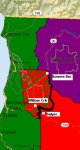
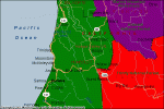
3) Make a legend for the colors. The shades of blue and green are not easy to recognize. I would suggest that you list the base frequency next to each color.
4) Place the number of each office on the map in the appropriate locations.
5) If possible remove the boundaries of the wilderness areas such as the John Muir Wilderness between Kings Canyon and Yosemite National Parks, the Emigrant Wilderness north of Yosemite. The other wilderness areas are labeled or named and should also be removed. The Ventana Wilderness south of Monterey is shown with boundaries only and could be removed. Northwest of Joshua Tree National Park is a wilderness boundary shown with no name." North of Redding the boundary of a portion of the Whiskeytown/Shasta-Trinity National Recreation Area is shown with no label. It should be removed. Joshua Tree National Park is full of busyness because the wilderness boundaries of that park are shown inside the exterior of the park. The exterior boundaries of the National Parks should remain as they provide information for orientation. North of Chester the boundary of Lassen National Park is shown, but it is not labeled. It should be labeled or removed.
This may not be possible as the base map you used is probably the source of all these boundaries and the labeling of them. It may seem like nit picking, however, whatever extraneous information you remove will make the map easier to read.
6) It would be helpful if you could show CHP Division boundaries differently than the area offices with the Division names and then make a legend, say in the lower left of the map, listing the CTCSS tone for each Division. The Division boundaries could be shown with a thicker black line.
7) Highlight the dispatch center cities by placing a star next to them. I noticed one area office not shown on the map and that is Mojave. It would be nice to have the area office shown in each area.
8) There are two places with “1 mile” shown. One over part of the word “Victorville,” and one just north of Joshua Tree National Park in the vicinity of 29 Palms.
9) I would see this most useful as a 8.5” x 11” map that can be put into a notebook. I carry a radio system reference notebook I put together when I travel. At that scale the color shades are difficult to decipher. At the zoom setting they seem to be better. The colors I observed in relation to this are: copper and gold look similar, amber and gold look the same (very little difference), brown looks green, red looks like dark orange, silver looks grey, violet looks brown, bronze looks like yellow, grey looks green, and maroon looks purple. Pink, orange, green, yellow, tan, grape, and turquoise are fine.
These changes would allow the user to determine the frequency, the tone, and the prefix of the unit designator by just looking at the map. As the map appears right now other reference information has to be used along with the map. The changes I've suggested would make this a "one stop shopping" reference sheet. At least as far as the primary dispatch channel is concerned.
Again, great job!