The note was added in late 2013 well prior to release.
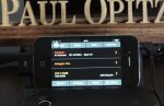
The top pic is clearly a mockup. It's been announced that the first version will be iOS, and that is clearly not an iPhone. And yes, the bottom pic (posted a week ago or so) does look close to the mock-up. All that says is that the programmer designed it well.
Still, there are differences. The battery icon and service type logo are different. There is also additional info in white not in the mock-up, not to mention a clear 'working' display that changes.
Is this deceptive? Uniden has always released mock-ups of products. So do car manufacturers and most other manufacturers. Before you build a product, you have to have a design for it that includes how you want it to look. Same with the Siren app. They made a pic of how they wanted it to look, and it looks like they got pretty close. It's also clearly a spin-off of the HP-x display. In fact, if you look at the design, it's exactly identical to the HP-x series. I bet it's a pic of the HP-1 superimposed on a smartphone and tablet.
They have a mock-up of some "Hello Kitty" models, too. Do you think they actually built those units to take a pic? (although one was an actual FM radio they touched up.

")