Hi Rick,
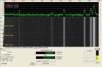
In this display, the horizontal axis is frequency (in this case kHz) while the vertical is signal level / time. Since these particular signals shown are continous, a continous vertical line at a particular frequency is shown to represent that signal. The width of the vertical line is a representation of the bandwidth used by that signal while the brightness represents the relative strength of the signal. And lastly, the lowest waveforms on the display typically represent the noise floor.
These are data signals only, and as you can see with NWC, many times barely perceptible above the noise floor. Since I am a novice, I like the ability to be able to see the signals rather than have to try and pick them out aurally.
Hope that helps,
Mike