Uniden SDS100 & SDS200 Color Schemes

alphaacres

Member
Premium Subscriber
Joined
Feb 3, 2006
Messages
212
Location
Oswego, New York
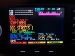
If you do not want to see something on the display just make it black text its not gone but it does not show on the display.
I make Info Area 1 the same color as Favorates List Name
I make Info Area 2 the same color as System Name and Soft1 Key
I make Info Area 3 The same color as Department Name and Soft2 Key
I make Channel Name the Same color as Soft3 Key

This keeps things very organized and easy to read on the display.
 

sparklehorse

Member
Premium Subscriber
Joined
May 15, 2003
Messages
1,214
Location
Portland, Oregon
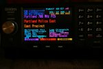
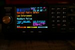
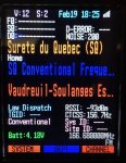
I may tweak some more but I'm pretty happy with this color scheme right now:

Detailed Trunk:

Detailed Trunk2.jpg


Detailed Conventional:

Detailed Conventional2.jpg

These colors are close but not 100% accurate. It's hard to get the white balance on my camera to match what I see with my eyes. It's even harder to shoot movies of the SDS200 because the camera wants to record a nasty moire pattern over the display text. I have to shoot video in 4K to get around that, but that did work. Would have been easier to shoot with my phone probably.

.
 

APX8000

Sarcastic Member
Premium Subscriber
Joined
Nov 23, 2004
Messages
4,358
Location
AES-256 secured
mancow has my vote. Simple, a few highlights here and there and not overwhelming. And I like the selection of colors...especially if mounted next to a few APX mobiles and in line with a vehicle’s interior display. The others are just too much.
d49dfb44ea4e8b37e48a5298c706478b.jpg


Sent from my iPhone using Tapatalk
 

N5XTC

Member
Premium Subscriber
Joined
Dec 24, 2012
Messages
819
Location
Hampton, Virginia
mancow has my vote. Simple, a few highlights here and there and not overwhelming. And I like the selection of colors...especially if mounted next to a few APX mobiles and in line with a vehicle’s interior display. The others are just too much.
d49dfb44ea4e8b37e48a5298c706478b.jpg


Sent from my iPhone using Tapatalk
blue is my favorite color so i really like your setup. i may make different profiles in sentinel and go back and forth when i get bored. i may use some of yours and call it "old blue".
 

cxgy2

Member
Premium Subscriber
Joined
Jan 19, 2018
Messages
36
Location
Grimsby, ON
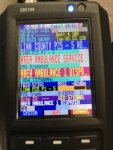
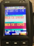
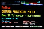
This is what I settled on. A less cluttered look. Spaces between the Sys-Dept-Ch-UID lines. All of my system names are simple service names. The unit ID name is made up of two parts joined together (1-16 and 17-30).DSC04874b.jpg
 
Last edited:

cxgy2

Member
Premium Subscriber
Joined
Jan 19, 2018
Messages
36
Location
Grimsby, ON
my only suggestion is to make the buttons match the 3 system, dept and channel above. maybe just use black background for them.

I tried your suggestion - colour text / black background and then black text / colour background. Either way had too much colour, imo, that distracted from the main colour text. I ended up going further the other way. I now have gray buttons with black text! - so that they stand out less. I may go back to white buttons. I'll see. The gray looks kinda violet.
 

cxgy2

Member
Premium Subscriber
Joined
Jan 19, 2018
Messages
36
Location
Grimsby, ON
I made two more refinements. System colour "OrangeRed" changed to "DarkOrange". Dept colour "Gold" changed to "Yellow". This makes all the colour text lines' brightness's match better. The yellow really stands out to highlight the user (department).
 
Last edited:
Top